Overview
The Buffett Indicator (aka, Buffett Index, or Buffett Ratio) is the ratio of the total United States stock market to GDP.
As of December 31, 2025 the ratio values are:
Annualized GDP = $31.33T
Buffett Indicator =
$72.14T
/
$31.33T
=
230%
This ratio fluctuates over time since the value of the stock market can be very volatile, but GDP tends to grow much more predictably. The current ratio of 230% is approximately 75.15% (or about 2.4 standard deviations) above the historical trend line, suggesting that the stock market is Strongly Overvalued relative to GDP.
Why Does it Matter?
The Buffett Indicator expresses the value of the US stock market in terms of the size of the US economy. If the stock market value is growing much faster than the actual economy, then it may be in a bubble.
For much more analysis and information on the data sources, methodology, and counterpoints to this model, continue reading.
Theory & Data
The Buffett Indicator is the ratio of total US stock market value divided by GDP. Named after Warren Buffett, who called the ratio "the best single measure of where valuations stand at any given moment". (Buffett has since walked back those comments, hesitating to endorse any single measure as either comprehensive or consistent over time, but this ratio remains credited to his name). To calculate the ratio, we need to get data for both metrics: Total Market Value and GDP.
Total Market Value
The most common measurement of the aggregate value of the US stock market is the Wilshire 5000. This is available directly from Wilshire (links to all data sources below), with monthly data starting in 1971, and daily measures beginning in 1980. The Wilshire index was created such that a 1-point increase in the index corresponds to a $1 billion increase in US market cap. Per Wilshire, that 1:1 ratio has slightly drifted, and as of 2020 a 1-point increase in the index corresponded to a $1.05 billion dollar increase.
For data prior to 1970, the most appropriate data for total stock market value is Z.1 Financial Account - Nonfinancial corporate business; corporate equities; liability, Level, published by the Federal Reserve, which provides a quarterly estimate of total market value back to 1945.
These combined data are shown below. The current estimate of composite US stock market value is $72.14T.
GDP
GDP (Gross Domestic Product) represents the total annual production of the US economy. It is measured quarterly by the US Government's Bureau of Economic Analysis. GDP is a static measurement of prior economic activity - it does not forecast the future or include any expectation or valuation of future economic activity or economic growth.
GDP is calculated and published quarterly, several months in arrears, such that by the time the data is published it is for a quarter that ended several months ago. The Federal Reserve Bank of Atlanta publishes GDPNow, an estimate of the current quarter's GDP growth rate, which can be used to calculate an estimate for the current month's (annualized) GDP value of $31.33 trillion dollars. A historical chart of GDP is shown below.
The Ratio of the Two
Given that the stock market value represents the present value of expected future economic activity, and that GDP is a measure of most recent actual economic activity, the ratio of these two data series represents expected future returns relative to current performance. (A bit similar to the P/E ratio of a particular stock.) It stands to reason that this ratio would remain relatively stable over time, increasing slowly as new technology creates more efficient returns from labor and capital.
Current Values & Analysis
The historic value of the Buffett Indicator ratio is shown below:
In this chart, the "Historical Trend Line" is an exponential regression line illustrating the historic growth rate of the Buffett Indicator ratio. Given the high volatility of the stock market value, the ratio tends to deviate from the trend line quite materially, sometimes for decades at a time.
The standard deviation gives insight into how relatively high or low the observed Buffett Indicator values are from the historical trend line. Bands showing +/- one and two standard deviations can be mapped onto the data, and are shown below:
These standard deviation bands correspond with CMV ratings to estimate overall stock market over/undervaluation. As illustrated, the current Buffett Indicator value of 230% is 2.4 standard deviations above the trend line, indicating the market is Strongly Overvalued.
And finally, below is the same chart normalized to show the historical average and standard deviation bands as straight horizontal lines, making it a bit easier to view trends over time.
Download Model Data
Want to dig deeper?
Our Data Download Membership gives you access to a monthly Excel file containing the full underlying dataset for every CMV model — including the Buffett Indicator. Perfect for investors and researchers who want to analyze trends, build custom tools, or incorporate this data into their own models.
Download a sample file to see the exact format (demo only; no real data included).
Data Download Membership also unlocks weekly data updates across the full site, our aggregate Market Value Index model, and more. Learn more about membership here.
Criticisms of The Buffett Indicator
No single metric is illustrative of the health or relative valuation entire market. Common criticisms of the Buffett Indicator are:
Interest Rates
The Buffett Indicator only considers the value of the stock market, but does not consider how stocks are valued relative to alternative investments, such as bonds.
When interest rates are high, bonds pay a high return to investors, which lowers demand (and prices) of stocks. Additionally, higher interest rates means it's more expensive for businesses to borrow money, making it harder to borrow cash as a way to finance growth. Any business that takes on debt will face relatively higher interest payments, and therefore fewer profits. Less corporate profits means lower corporate stock values. The corollary to this is also true. Low interest rates means bonds pay less to investors, which lowers demand for them, which raises stock prices in relation to bonds. Low interest rates make it easy for corporations to borrow cash to finance growth. Corporate interest payments will be low, making profits higher.
This is all to say that all else equal if interest rates are high, stock prices go down. If interest rates are low, stock prices go up.
Over the last 50 years the interest rate on 10 Year US Treasury bonds has averaged 5.82%. During the peak of the .com bubble when the Buffett Indicator was very high, the 10Y Treasury rate was a bit higher than average, around 6.5%, showing that low interest rates weren't juicing the stock market. Today the Buffett Indicator is still quite high relative to its historical trend line, but interest rates are still relatively low, currently at 4.18%.
This can be interpreted to mean that during the .com bubble, equity investors had other good options for their money - but they still piled recklessly into stocks. Whereas today, investing in bonds returns relatively little. Today's investors need to seek a return from somewhere, and low interest rates are forcing them to seek that return from riskier assets, effectively pumping up the stock market. While this doesn't justify the high Buffett Indicator on any fundamental basis, it does suggest that the market today is less likely to quickly collapse like it did in 2000, and that it may have reason to stay abnormally high for as long as interest rates are abnormally low.
For additional detail on the effect interest rates have on stock prices, view our Interest Rate Model.
International Sales
A second fair criticism of the Buffett Indicator is that the stock market valuation reflects international activity while GDP does not. Though GDP does include national exports, it would not include something like the sales Amazon makes in India (sourced from Indian fulfillment centers and sellers). However, Amazon's India business is definitely priced into its overall stock price, which is listed in the USA. Imagine if the Indian government banned Amazon from the country and shut down all its operations/subsidiaries there. This would lower Amazon's stock price, which would lower overall US stock market value, but have no impact on US GDP. That is, the Buffett Indicator would fall. Globalization has expanded steadily over the last 50 years and has been a key driver in the growth of the Buffett Indicator over time, since US stocks have risen in value due to overseas activities not included in US GDP.
This is a very fair criticism of the Buffett Indicator itself -- though not necessarily for the valuation model presented here, which looks at the Buffett Indicator relative to it's own exponentially growing trend line. Our model expects exponential growth of the indicator over time, such that we have a "fair" Buffett Indicator value of 50% in 1960, growing to ~120% in 2020. Part of that natural increase is due to technological advances that lead to higher profits for existing firms, or from the creation of new industries entirely. Another part of that natural increase is because US market value is growing faster than GDP due to the rise of international sales of US-based firms. The key point here is that the model is looking at relative performance against the indicator's own trend rate, and not just saying "the Buffett Indicator is high".
Additional Resources
Below are some classics on fundamentals-based value investing. While these aren't specifically about the Buffett Indicator, they espouse similar ideas, and are strongly recommended resources.
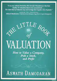
The Little Book of Valuation
byAn accessible, and intuitive, guide to stock valuation. Valuation is at the heart of any investment decision, whether that decision is to buy, sell, or hold. In The Little Book of Valuation, expert Aswath Damodaran explains the techniques in language that any investors can understand.
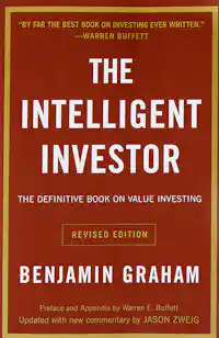
The Intelligent Investor
byThe greatest investment advisor of the twentieth century, Benjamin Graham, taught and inspired people worldwide. The father of value investing, this is the updated classic from 1949.
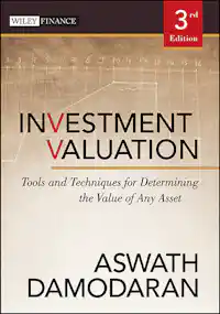
Investment Valuation
byThe definitive textbook on all topics related to investment valuation tools and techniques. Literally a textbook - not light reading.
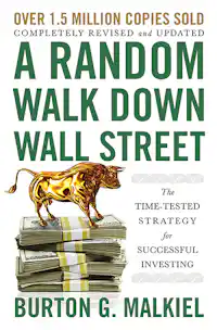
A Random Walk Down Wall Street
byWhether you’re considering your first 401k contribution, contemplating retirement, or anywhere in between, A Random Walk Down Wall Street is the best investment guide money can buy.
Data Sources
The below table cites all data and sources used in constructing the charts, or otherwise referred to, on this page.
| Item | Source |
|---|---|
| Z.1 Financial Account | Board of Governors of the Federal Reserve System (US), Nonfinancial corporate business; corporate equities; liability, Level [NCBEILQ027S], retrieved from FRED, Federal Reserve Bank of St. Louis
Used to estimate aggregate market value prior to 1970. |
| Wilshire 5000 | Wilshire 5000, data accessible from the Financial Times.
Used to estimate aggregate market value, 1970-present. Adjustments made in-line with Wilshire guidance that in 1985 a 1-point change in the index corresponded to a $1B change in aggregate market value, and by 2020 a 1-point index change corresponded to $1.05B in market value. That drift is extrapolated on a straight-line basis to present day. |
| GDP | U.S. Bureau of Economic Analysis, Gross Domestic Product [GDP], retrieved from FRED, Federal Reserve Bank of St. Louis;
Used for all historical GDP data. |
| GDP Now | GDPNow - Federal Reserve Bank of Atlanta
Used to estimate current quarter GDP. |


